
Rebranding Raëlism
Visual Design / 2023
This project proposes a visual identity that translates Raëlism’s ideological principles into a coherent and expressive graphic system.
Building on this proposal, design is positioned as a tool to communicate ideology and narrative, investigating how it can reinterpret meaning through brand definition, conceptual development, visualization, and storytelling. Through this lens, Raëlism’s visual language is reimagined to translate its ethos of liberation and open-mindedness through narrative-driven design.
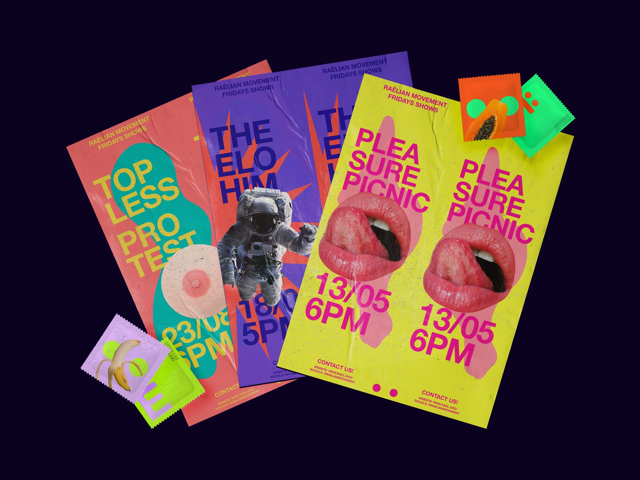
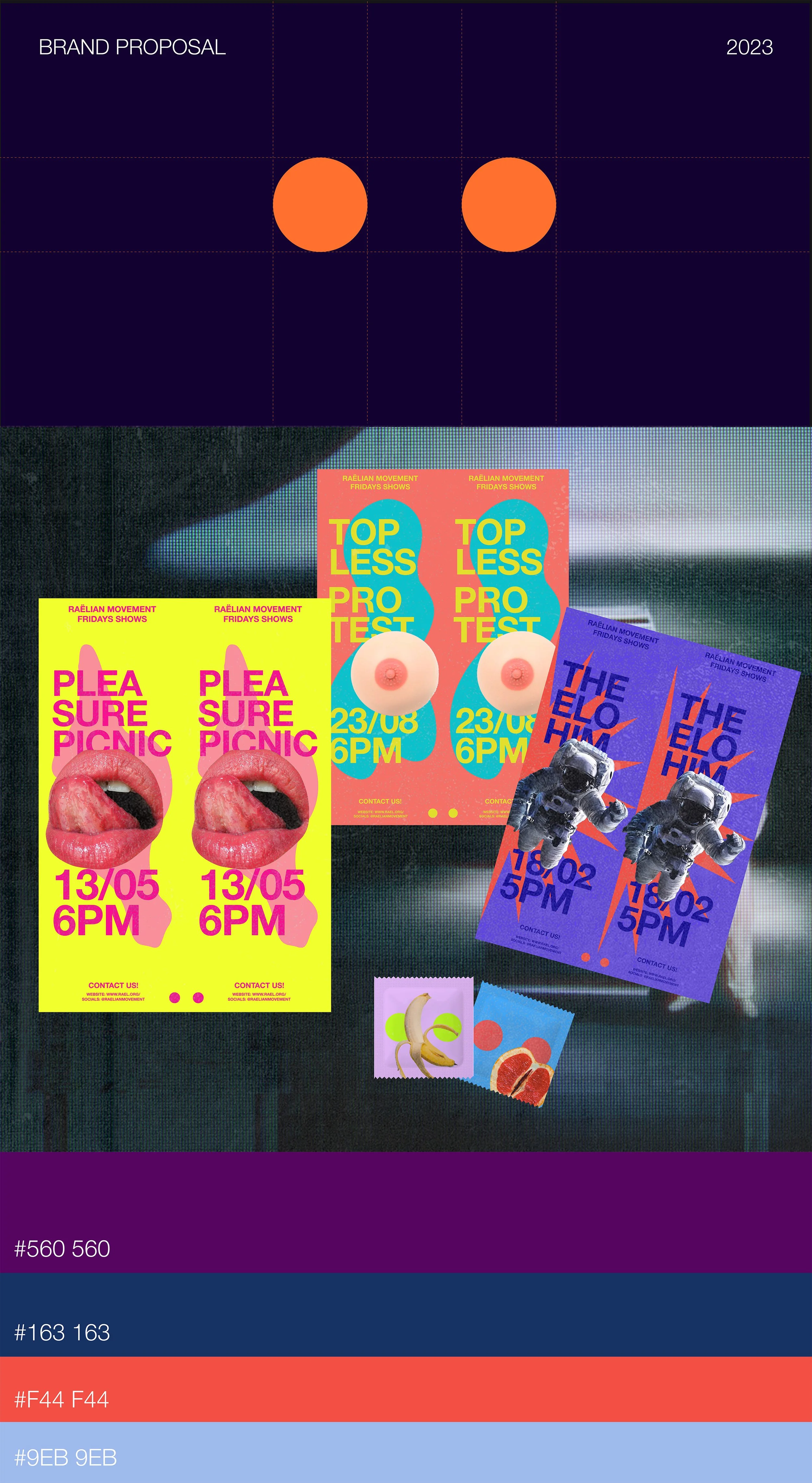
The art direction is anchored in the concept of cloning, constructing a system based on repetition, duplication, and symmetry across typography, color, and composition. Within this logic, each graphic decision acts as a direct extension of the project’s discourse, resulting in an identity that is coherent, expressive, and playful.
**This project is a conceptual design exploration and is not affiliated with or endorsed by Raëlism or its organization. It is intended as a creative exercise. Viewer discretion is advised.
A reframe on a visual system
The logo abstracts the diaeresis of the ë from the original French name as the primary visual element of the brand. From this element, a visual language is constructed based on repetition, duplication, and symmetry, where each component responds to a logic of cloning. The logo is structured through the precise use of negative space; for this element, the color can be any that provides contrast within the selected palette.
The system is translated into printed pieces through dual compositions that replicate elements symmetrically. Repetition reinforces the concept of cloning as a structural principle of the project. The image treatment introduces a provocative and playful tone, incorporating traditionally informal elements, such as cutouts without backgrounds, which contrast the rigidity of the system while maintaining coherence.
The color palette is defined through values that follow the hexadecimal structure #XYZ XYZ, reinforcing the brand’s central concept through systematic repetition. This system allows for the generation of multiple combinations within a controlled framework, maintaining visual consistency while introducing variation.